Kickoff
The redesign of the Savings Vault was initiated due to the product's significant popularity, making it a key product for customer acquisition and retention. Given this, the team decided to seize the opportunity to enhance the user experience from the ground up.
In collaboration with the Product Owners, we emphasized the importance of understanding long-term objectives to plan strategic research effectively. The fact that developers were simultaneously refactoring the underlying code gave us the freedom to completely rethink and redesign the user experience. Our goal was to maintain the product’s strong Net Promoter Score (NPS) of 64, as the product plays a vital role in generating passive income for the company.
Role: Product Designer (team of 2 designers and 1 researcher)
Skills coverage: Product Design, UX Research, Project Management
Duration: 8 months
Challenge
To redesign the Savings Vault, a savings product offered by a Fintech that serves as a flexible tool for users to set aside funds with no interest for specific goals.
My role
This project allows me to showcase my design process rather than just a final product and exemplifies the perfect alignment between user needs and business goals.. Opportunities to work on comprehensive, end-to-end projects like this are rare, providing me with significant creative freedom. I led this project design wise, starting as the sole product designer, and later expanded to include another product and additional research.
Saving Vaults
Fintech
Strategic Research
When developing the research plan, it was essential to engage directly with users through in-depth interviews. There were multiple potential directions for redesigning the experience, but the key to success was keeping the real users in mind. We focused on defining four behavioral segments.
After conducting the interviews and analyzing the data, we launched a survey to validate insights and distinguish between key jobs to be done and anecdotal or corner cases.
Since we lacked metrics or existing data for this product, I also conducted a heuristic evaluation to assess our current funnels and identify areas for improvement.
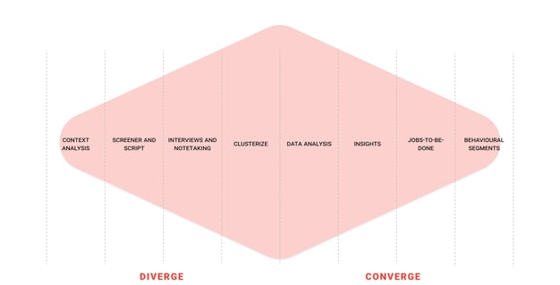
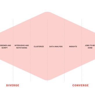
Behavioural segments' methodology
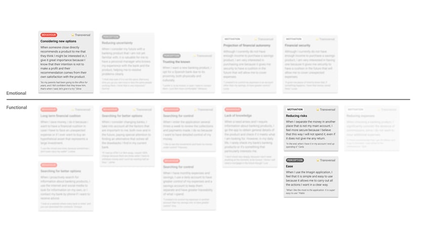
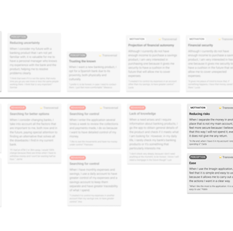
Main insights
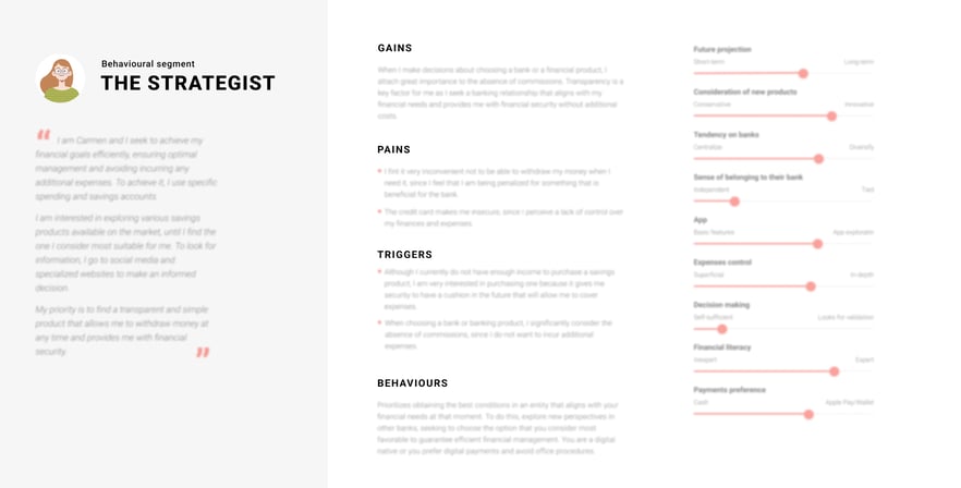
After interviewing 16 users of the company's current Savings Vault to cover a wide range of demographics and validating the insights quantitatively, we then defined a matrix with two axes: emotional and functional behaviors, distinguishing behaviors from the perceptions or motivations driving them. Some insights were cross-segment, while others were quantified to ensure accurate representation within the behavioral segments.
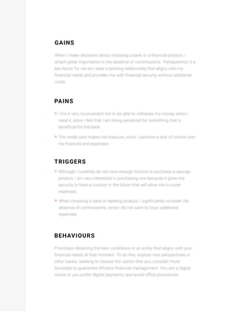
One of four behavioural segments defined to shape the user experience of the vaults.
All results have been intentionally blurred for confidentiality.


🎯 Goals
To transform the insights obtained in the project of attitudinal segments for into potential product solutions for the customer.
💡 How
Absorbing user personas and insights
Identifyin challenges that each segment presents
Generating ideas
Clustering and voting ideas
Prioritizing ideas (cost-impact matrix)
📌 Challenges
How could we encourage users without financial literacy, who may feel intimidated by more complex saving products, to be able to save money by diversifying the sources from which they save?
🧚 Participants
Business
● Head
● 3 Product Owners
Tech
● Technical Owner
Sales
● Sales Manager
● Sales Trainee
UX
● UX Lead
● 2 Product Designers
● Researcher
Behavioural segmentation workshop
Then we conducted a workshop with four key business stakeholders to prioritize solutions, ensuring that we developed something feasible and aligned with business objectives. Once we had narrowed down the challenge and secured buy-in from all stakeholders, it was time to start crafting the deliverable.
Key highlights from the benchmark.


Benchmark
Once we had narrowed the challenge down, we continued by conducting a benchmark analysis of six savings products with features that allow users to add money from different sources, covering botch traditional banks and fintechs and focusing on BBVA, Santander, Revolut, Banco Sabadell, N26, and Goin.
Based on this analysis, the card rounding and paycheck rounding features were incorporated into the product, enabling users to automatically transfer spare change into the vault.
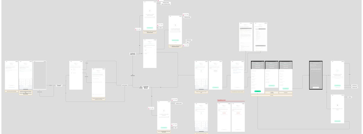
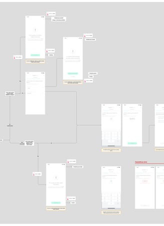
Example of a navigation flows, including corner cases and recommendations to developers.
All designs have been intentionally blurred for confidentiality.
Wireframes
With another Product Designer that joined the project, we started drafting our wireframes, validating along the way with Developers and Product Owners.
We worked on the following funnels
● Opening savings vault
● Setting goal
● Viewing savings vault
● Terminating savings vault
● Adding money
● Withdrawing money
● Periodic contribution
● FAQs
● Viewing vault on dashboard
Iteration
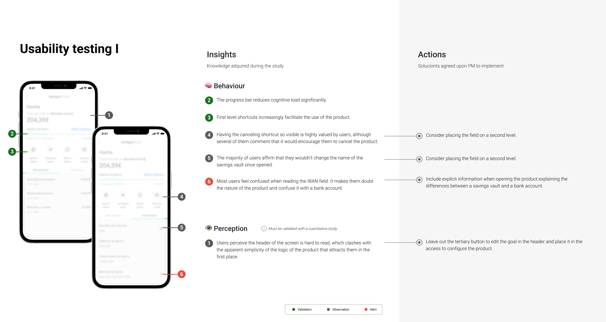
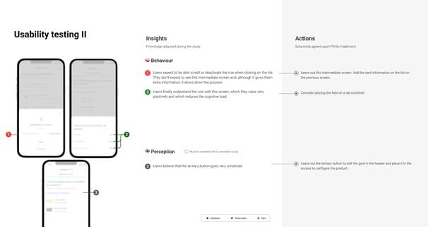
After developing the wireframes, I conducted a series of usability tests to evaluate both the usability and comprehension of the proposed design. This testing was essential for identifying any areas of confusion or difficulty that users might encounter. By observing user interactions and gathering feedback, we were able to pinpoint specific areas for improvement within the user funnels. This iterative process ensured that the final design would better meet user needs and enhance the overall experience ensuring timely iterations.
Example of the deliverables from the usability tests.
All designs have been intentionally blurred for confidentiality.


Next steps
This is how I would approach the following steps of the project.
Have a project in mind?